Tag Archives | infographic

Mobile and twitter usage pattern in Lebanon

I just stumbled upon this cool website that made use of more than 280 million tweets to reveal geographic mobile and twitter usage patterns.

mobile use

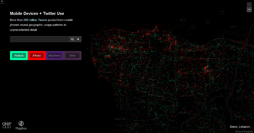
The above screenshot shows the usage pattern in Beirut. But looking at Lebanon map, you can notice that most mobile twitter users are located in or around Beirut, and the majority of these people use either iPhone or Android.

Thank you Mireille

0

Mobile internet users behavior in Lebanon

Alfa Telecommunications released some nice infographic during Arabnet 2013 two weeks ago showing the most popular smart phones among their users along with the most visited websites and what services are mostly used.

Click on the photo to enlarge.

alfa telecommunications

For more about internet usage in Lebanon and e-commerce habits, make sure to check this inforgraphic compiled by Jad Rahme using data released by Ipsos MENA also during Arabnet 2013.

2

Lebanon Internet Porn Habits

According to Porn MD, below are the top 10 most common terms that we, the Lebanese, have searched for on porn sites over a 6 month period.

pornmd

You can check what the world is searching for here.

4

We love Mercedes Benz and we like them white

Mireille, probably the geekiest blogger in Lebanon, made two interesting charts showing the most popular car brands and colors in Lebanon, most probably by making use of the Lebanese cars database that was leaked earlier.

The most popular brand unsurprisingly turned to be Mercedes Benz with 22% (mostly taxis?), while the most popular color turned to be white with 19%.

What was really interesting to know though is that 57% of the Lebanese cars are more than 20 years old, and 83% are more than 11 years old! Tells a lot about our purchasing power…

5

Powered by WordPress. Designed by WooThemes